
One Size Doesn't Fit All

How working in e-commerce analytics made me question if we truly innovate in the world of design & data.
UX/UI Designer for Seelk Studio, Nathaniel Daudrich breaks down the role of e-commerce analytics and how to inspire better product design in the murky waters of an analytics SaaS.
The jury is still out on what kind of influence Google Analytics has had on the world of data analysis and data visualization. The level of influence, notwithstanding, is indisputable. It is, almost certainly, the most widely adopted web stats services out there. However, when you look at the platform with a critical lens, you begin to realise that it both revolutionized AND distorted analytics — for better or for worse. Put it this way: Google Analytics is (partly) responsible for how we as data visualizer now struggle to truly innovate analytics software.
But take a sigh of relief, this article isn't about me criticizing Google. I'm just using Google Analytics as inspiration or maybe a starting point to understand where data and design meet in the universe of analytics today and where we can innovate in data visualization. My dream is to put the user back in the driving seat and dashboard back where it belongs — below the windscreen.
A quick note about what we're building at Seelk Studio!
Seelk Studio is an analytics SaaS built for Amazon Vendors and Sellers. We gather various market, advertising, product and sales data from Amazon and provide users with actionable insights for improved business growth.
What started as an internal tool for Seelk’s Amazon agency business back in 2017, is now a boutique SaaS serving companies such as BIC, Church & Dwight and Bridgestone.
The myth of the dashboard — the origins of story
Quick note - for those who don't know - the word analysis comes from the Greek ana- + lȳ́ein — which basically means to "loosen up".]
While Google Analytics set the gold standard for analyzing website metrics, it is also (somewhat) responsible for how the vast majority of designers and data analyst think they should visualize data. Having worked in the SaaS world the past two years, I feel modern analytics are far from loose, pardon my Greek. Loose, for me, is a metaphor for simple design. Loose is our ability to consciously breakdown complex elements into their logic parts and organise them into a humanly digestible form. Loose is what we should strive for, but sadly, it is not what we've become.
I often feel, as Menschen der Analytik (yes, I just made that up), that we are trapped in this intangible realm of the "single screen dashboard" — it has become the go-to format for designers and development teams to build a one-size-fits-all solution to suit their users needs.
If I painted a spectrum of the universe of dashboards — on left side you have your hyper-sexy dashboard (just go search for "dashboard" on Dribbble) with components juxtaposed together without rhyme, reason or any feasible data in mind, cascading colors and multi-colored gradients in graphs using a dark-mode theme (shall I continue ?). By the way, these dashboards rarely ever get made (except for in Mission Impossible and eventually in Tesla's 2027 Model S) — they of the fragments of designers' dreams (tasty fodder for tech recruiters lost in the recesses of candidate's portfolio). These dashboards are about showing off with aesthetics and a modern user interface rather than getting a heart of a user's needs or solving a practical problem.

On the right side, however, you have the utterly-functional, purposefully-built, based-on-real-life-metrics, sometimes built with meticulous detail, filled with toggles, drop-downs and filters to provide you with a plethora of mind-bogging ways of changing and displaying data. These dashboards do get made, and Google Analytics is not far from this end of the spectrum.
Between these two spectrums are some great practical dashboards — hopefully some of you use them. The day-in-day-out cockpits that gather all your KPIs in one place and simplify your life — the well-built Metabase dashboards of this world. This is the realm of KPIs — providing user with impactful data on what to do next and how to do it best.
It's just not enough.
Despite these dashboard gathering data dynamically from multiple complex sources (and at the speed of light), they are inherently flatfooted and static when it comes to guiding the user. They say "such and such metrics decreased by 12% and 30%", but the user user is left filling in the blanks and trying to figure why! Sure, you learn to do the analysis yourself, but you still feel the pain.
As designers and developers of analytics SaaSi (the plural of SaaS — it is not SaaSes), some of us are guilty of this — I include myself. We think that displaying the data in a clear or sexy way is enough and we completely forget to structure the data as we would a simple product website or even a product page on a online marketplace!
What's worse, is that when we build a website for our SaaS products, the catch phrase you'll get in then boardroom during the first brainstorming session is: "We have a tell a story!" With that in mind, generally speaking, we manage to piece together well-design and written vignettes about the value proposition — clear messages, strong typography, visual aids and metrics that speak to the user. A visitor magically scrolls through the content and is taken by the hand through each of the key features, capped off with a glorious 1 minute video that summarizes all the use cases the SaaS provides solutions for.
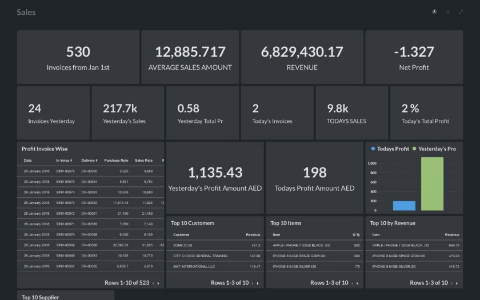
Now that you're feeling inspired, you think to yourself: "Damn! I gotta get me summa'dat". You sign up and then plunk — you see this:

First reaction: "What the hell is this?". And Let me say — this dashboard isn't all that bad in my opinion, it's somewhere middle right of the dashboard spectrum . However, let's be honest, there's probably a complete disconnect from not only what you were sold on the website, but how you were sold it and what you're now experiencing, which is flat, boring and tedious.
The website employed storytelling which captured your imagination — so why can't that method be applied to the analytics software itself? Why are we limiting ourselves to typical dashboard components? Why has this become the status quo?
Without going into the specific of who and when, there have, of course, been innovations on how to group and structure analytics, but only a few SaaS have truly innovated the experience of how a user analyzes and how it powerful solutions to big problems. A few come to mind, but I will let you try to find them yourselves.
How can we innovate?
As designer and developers of SaaS analytics products we often shy away from providing the user with an experience. Instead we opt for the industry standard (think SPAM®) showing them data the way they are use to seeing it.
Displaying the metrics is not enough, ladies and gentlemen, no matter how to visualize them.
Here's a few tips on how we can improve:
1. Understand context, not just the user
It is our job to understand our users pains and needs and clearly address without doing what is simple for us as developers.
For users of Google Analytics the world is relatively straight forward — you either know how to use the software (you've probably taken a course) or you don't. Nonetheless, you better learn quick otherwise you're going to start losing money and maybe your job, company (then car, dog...). This world of analysis is filled with scenarios which require small adjustments and actions — a cockpit-like interface, so to speak, with tiny buttons, date pickers and toggles — all piloted on a platform that has made their software the only way for you to access this information.
Because of this, the user-base of Google Analytics have become relatively uniform. The platform itself is now greater than the user, to the extent that the user must both adopt the logic of the software and placate their own pains and needs.
This is not the case for the vast majority of startup SaaSi!
In Seelk's world of Amazon ecommerce analytics, we've realised a few important important things as we've build out our SaaS:
- The demands and pains of users are multi-faceted
- The importance of core personas against the other is very hard to ascertain because both decision-makers and implementers have different needs and expectations
- Individual personas do not all have the same expertise
- Reporting and analysis will always be a problem no matter how much data you give a user
I'm not saying that Google Analytics doesn't also have its catalog of use cases and personas, but when you're first developing and understanding users for an ecommerce SaaS, you get caught up in the excitement of dealing with new data, which metrics to display and how and you forget to ask yourself in which context and how will x, y and z type users understand what you are communicating to them.
The tendency is to think that you can educate the user, which is often the chosen solution, but I believe the key to understanding how to display and visualize deep knowledge of the various use cases users go through in their day-to-day work. Finding the ultimate solution to a user's problems perhaps unrealisitc, but with clear understanding of a each personas' context, you can already do away with the guess work and build solid foundations for meeting their needs.
Just because you have displayed one metric in a specific place does not mean that you can't show it somewhere else differently. Try to open your SaaS' design ethos to not just testing and iteration in the user experience, but more simply, in the format and presentation of data.
There is no one size fits all!
2. Just because it's a dashboard doesn't mean it needs to fit on your screen!
Ok, maybe this sounds a little bit obvious, but as I said above, as analytics SaaS design teams we have tendency to ideate and develop within the right side of the dashboard spectrum. We often miss the salient point that we are emphasizing the dashboard itself rather than how the user actually wants to digest the data.
Generally speaking your user is trying to access your product either via a web browser or a mobile device. They have the ability to touch, click and scroll. This sounds crazy, but these are key levels of interaction which are often overlooked and generally misunderstood.
Our "dashboard component-based logic" of trying our darnedest to place everything within a single viewport ignores the fact that a user can more easily digest what they are experience through scrolling and seeing simple data, rather than complex forms with button and toggles. But still, somehow we regularly over-look this. (Oh, and scrolling through a data-table doesn't count!) As designers and SaaS developers it is our responsibility to juxtapose and present elements on a page with clarity and a healthy fusion between simplicity and meaningful data visualisation.
Google Trends is currently at the top of my list for this form of execution. Benefiting from the solid groundwork of Material Design and further developing that into a simple value proposition: I want to compare some keywords! Google has managed to create something where every interaction is meaningful. Quickly compare two keywords, click on a subregion, deep-dive, check a related keyword and so on. The flow is seemless-cum-simple, and the message is very clearly — some people still think Biggie and Tupac are alive.

3. Build dashboards as you would a report or a pitch deck
When you build your dashboard try to first break it into its logical sections as you would a report or a pitch deck. For example:
- Executive summary
- Key performance metrics for the last 30 days compared with the previous 90 days with a graph to show growth acceleration
- A list of best Sellers + rising stars
- etc.
For the love of God, do this simply. Try to understand that people don't always (at least at first) want to change the date or switch metrics to figure what they need to know. Generally speaking (and we've learned the hard way) they just want to scroll through and have the data presented to them.
Don't be blind to KPIs — insight is not a mirage
Telling me how much I sold last week is about as interesting as getting the bill at your favorite restaurant — you probably already know how much it is. So, when looking at your key performances indicators or metrics, it is the subtle inter-relation between them that provides you with the great oasis of "insight".
Insight, as mysterious as it has become, simply put is your ability to understand something clearly.
Taking the extra step to properly understand which KPIs work together and how can be the difference between displaying data and properly analyzing your business. They are very different world's and you should always take the extra time to truly comprehend your basis of metrics before trying to figure out how to display them!
Innovation has its foibles
I still have this uncomfortable memory of a debate with a colleague over a dramatic change I was lobbying for our product's next development cycle. Long story short, I wanted us to build reporting platform - giving the user a DIY interface for adding text, images and data components (graphs, tables and panels), etc.
I remember my colleague saying to me "I don't know if you've seen the movie Jobs, but there is a scene where Steve Jobs says to Woziack, 'We want end to end control. Completely incompatible with anything else.'
According the Apply lore, Wozniack reluctantly follow suits and when Jobs unveils the translucent blue-green iMac G3, Jobs says 'How’s that for a compromise, Woz? You still can’t get into it, but you can see into it.'"
Long story short, my gracious colleague was trying to tell me that our success as a product lies not in giving our users the freedom to choose what they want, but in us giving them exactly what they need.
There is a lot of truth to that and at the time I agreed with him — but I think we were both short-sighted about the market we're dealing in — ecommerce, where the whole world comes to analyse their sales!

Nathaniel Daudrich
Product Designer at Seelk


